Introducing Blueshift’s New Brand Identity
Feb 23, 2023
As a leading protocol that connects various blockchain ecosystems, we have chosen to redesign the Blueshift brand with a vibrant and inclusive design solution to universally represent our goal of making DeFi accessible for all.
The company brand, Blueshift, is reflected in the logo, taking inspiration from physics when light is moving to and from a person’s perspective creating a redshift and blueshift effect. The diverse colour pallet spectrum from orange to blue represents the different ecosystems we aim to connect. And dynamic and fluid elements of our logo reflect our agility as the team is constantly delivering innovations, adapting to user needs and shaping the ever-changing DeFi space.
Ultimately, our new brand identity reflects our transition from being a DEX into our long-term vision of being a cross-chain solution, connecting ecosystems, and driving adoption. We also strive to make DeFi accessible and user-friendly for a wider group of users by providing knowledge, transparency, and data through education and visual analytics to help people make informed decisions.
Naming Origin Inspired Blueshift’s Exploration of a New Brand Identity
For all of us who don’t know, redshift and blueshift are important concepts in astronomy that help scientists determine the distance of objects from Earth. The concept is key to charting the universe’s expansion, which resembles the cross-chain expansion that Blueshift has embarked upon.
Redshift and blueshift describe the change in the frequency of a light wave depending on whether an object is moving towards or away from us. When an object is moving away from us, the light from the object is known as redshift, and when an object is moving towards us, the light from the object is known as blueshift.

Our colour pallet represents this phenomenon as liquidity moves cross-chain to and from various blockchains via Blueshift.
Blueshift’s New Colour Palette Promotes Inclusive Finance for All
With our strategy of expanding to other chains and being a foundation for cross-chain ecosystem indexes, we realised that we need a very versatile colour palette to integrate and work closely with all sorts of brands and companies from any blockchain.

This new colour pallet encompasses an idea that conveniently coincides with our philosophy of interoperability and cross-chain compatibility. It perfectly aligns with our goals as a DEX that works with any blockchain.
In addition to Blueshift’s focus on cross-chain interoperability and driving adoption, our new branding style also embodies the principle of inclusive finance. The vibrant and diverse colour palette, which includes a rainbow spectrum from orange to blue, reflects the company’s commitment to providing access to DeFi for all.
By creating a more inclusive and welcoming brand image, Blueshift is signalling that it values diversity and is committed to building a financial ecosystem that serves everyone, regardless of their background or identity. The new branding is a clear statement of the company’s mission to create a more equitable financial system that is open to all and provides opportunities for everyone to participate and thrive.
Revitalising Our Brand Identity: Updating the Logos for Our Company and Token
Now that a clear branding style has been established, the team embarked on a logo redesign for Blueshift to amplify the change the brand identity is having.
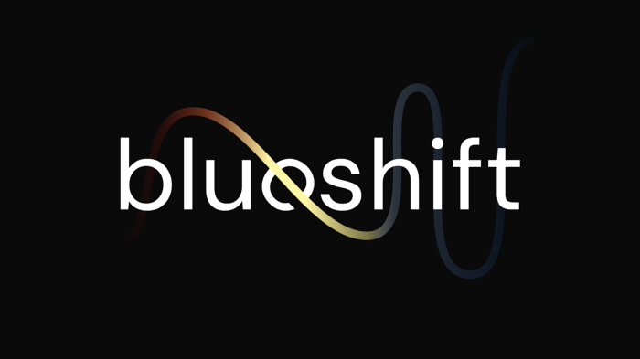
Our new logo embodies the connection between our company name and token through the central element, where the crossed “e” resembles our Blues token. We refreshed our token logo with a sleek, fluid design incorporating a vibrant orange shade while maintaining its recognisable shape.

Our logo’s dynamic and fluid design symbolises our team’s nimbleness in constantly innovating, responding to user demands, and shaping the ever-evolving DeFi ecosystem. With this logo, we aim to convey our commitment to progress and growth in the industry while staying true to our core values and identity.
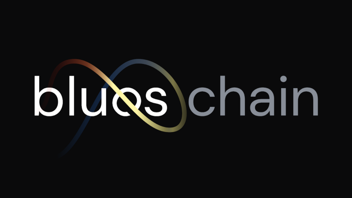
The new logo style also allowed us to iterate it for other products, such as BluesChain, our new cross-chain protocol built to allow for easy cross-chain swaps between different chains.
Introducing Our New Website: The Ultimate Destination for All Our Community’s Needs
The new colour scheme and branding style have rebranded our digital assets. With this change, we have also updated the core Blueshift website, which will now act as a central hub for all of our media, marketing and content that we produce for the community, including our podcast and tutorials.
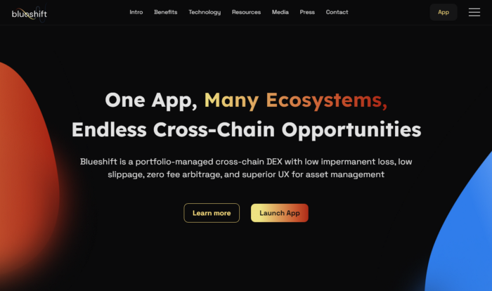
We’ve geared the new website to reflect better what Blueshift offers, not only as a portfolio-based DEX but also as a cross-chain interoperability layer between major blockchains. We wanted to have our main website communicate this clearly and simply.
The new website will allow us to create educational resources and publish them for our community. Education in the DeFi space is crucial for adoption. Our new website will allow for this. In addition, our audio podcasts, video walk-throughs and written tutorials will help you in your DeFi and blockchain journey.
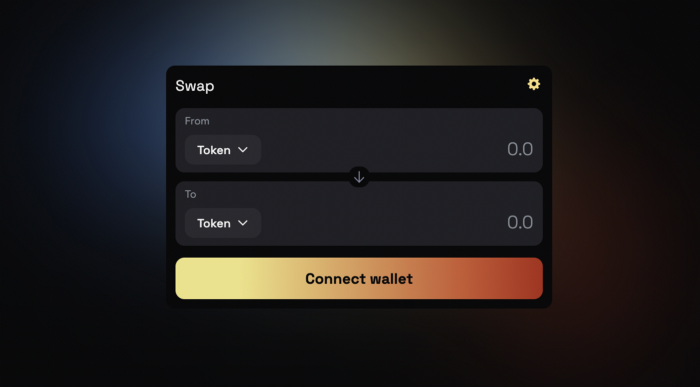
We also introduced the new UI throughout our app:
Conclusion
In conclusion, the rebranding of Blueshift represents a significant step in the company’s evolution. The new branding style, including the updated colour palette and logos, represents the team’s transition from being a DEX to a cross-chain solution, connecting various blockchain ecosystems and driving adoption. The team’s philosophy of interoperability and cross-chain compatibility is now embodied in the new colour palette, reflecting the idea that liquidity moves cross-chain to and from various blockchains via Blueshift. The new website will provide educational resources to the community, helping users navigate the DeFi and blockchain space more easily, and making DeFi more accessible for all.
We appreciate all of our users and companies that have worked with us since the inception of Blueshift and look forward to growing with you all.

